Colour
Colour provides a basis for a consistent visual language, aiding in brand differentiation and recognition.
With the new Sustainable Development Goals, UNAIDS has updated its colour palette.
Brand colours
| cmyk(0,100,81,4) | rgb(227,24,55) | #e31837 | |
| cmyk(0,0,0,100) | rgb(0,0,0) | #000000 | |
| cmyk(0,0,0,60) | rgb(128,130,133) | #808284 |
UNAIDS Red to be used as an accent or violator colour.
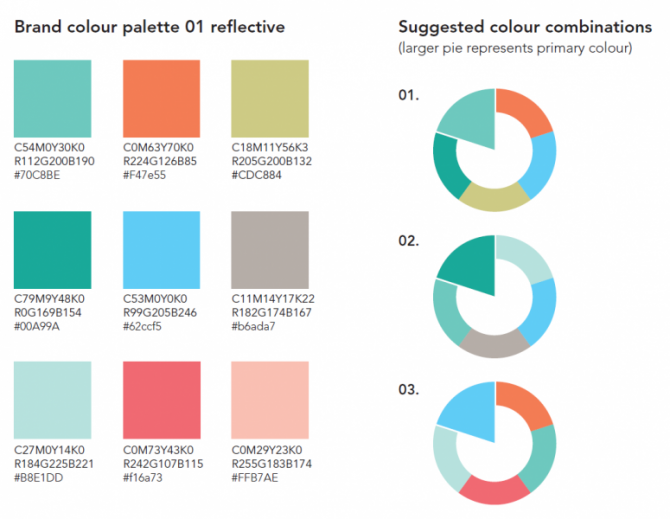
Reflective colour palette
The reflective colour palette is the primary palette to be used for UNAIDS materials. This palette sets a tone that is reflective, honest, authentic, clear, Intelligent (backed by data).
It is important to select one brand colour palette, either reflective or bright and not mix the two. From the selection of one of these palettes it is recommended to select one primary colour and to use other colours minimally to highlight key messaging or headlines.
Below is the UNAIDS colour palettes with equivalents for print and digital mediums.
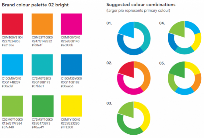
Bright colour palette
The bright colour palette is the secondary palette to be reserved for use on select special UNAIDS materials. This palette sets a tone that is Loud (with clear conscience), Energetic and Vibrant.
It is important to select one brand colour palette, either reflective or bright and not mix the two. From the selection of one of these palettes it is recommended to select one primary colour and to use other colours minimally to highlight key messaging or headlines.
Below is the UNAIDS colour palettes with equivalents for print and digital mediums.
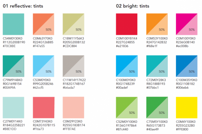
Colour for charts, graphs and other data visualization
For the most visual impact, It is best to use a limited colour palette rather than all colours from the palette. The only exception to this is for charts and graphs when more colours are needed for separation and distinction between items.
Additional colours can be made by creating tints of 50% opacity. Below are the colours that can be tinted, without diminishing the integrity of the palette.


